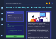
SafetyNet
This is Sarah.
She is 12 years old, loves gaming, and
connecting with friends online.
She secretly made a social media
account to talk with her school friends.
One day she got a friend request from
“Jake12”, but didn’t recognize it.
...What Sarah doesn't know is that she's just become one of the 20% of tweens who encounter online predators. [1]
Project Safe Childhood. (2024, April 11). Retrieved from https://www.justice.gov/usao-edtx/project-safe-childhood
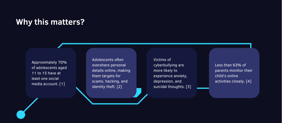


- Most current tools focus on blocking/filtering after the fact.
- Only 39% of parents use parental controls for proactive monitoring.
- Tools focus on restriction rather than education and empowerment.
- Current solutions create adversarial relationships between parents and children
Developing a Persona
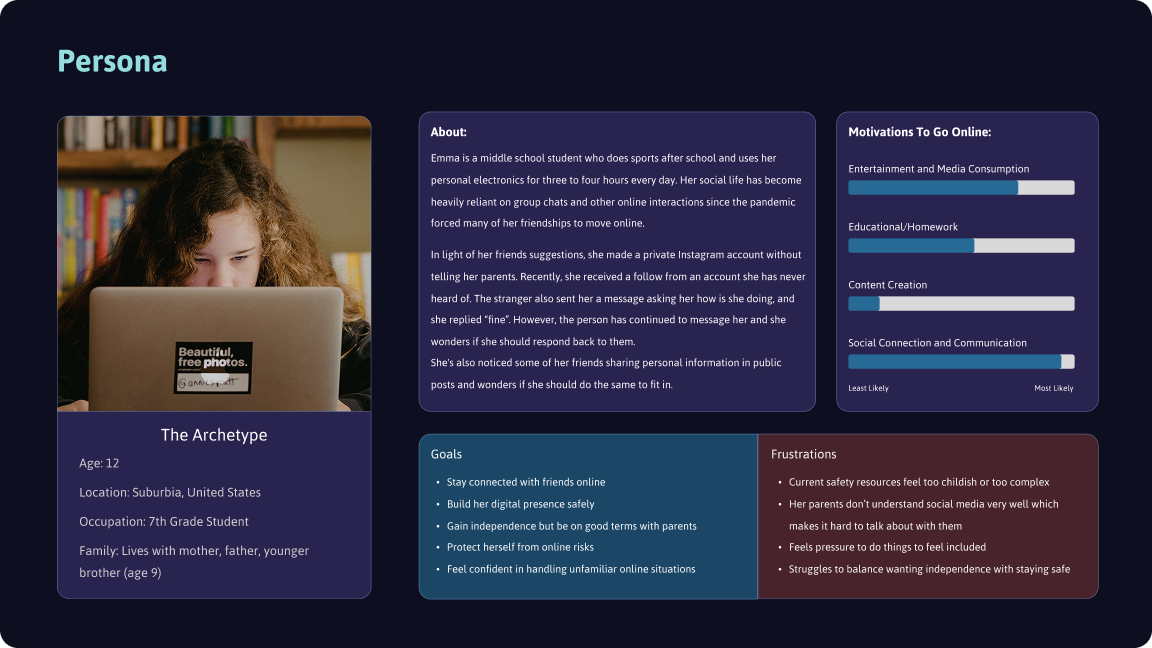
I created a persona to ground design decisions in the needs, behaviors, and goals of a representative user. This helped ensure the product experience stayed user-centered throughout the process, aligning features and interactions with real-world context.
Establishing Goals
Defining clear goals helped focus the design process on what mattered most to users and the business. These goals served as a benchmark for evaluating design decisions and ensuring the final solution stayed aligned with the project’s purpose.
I wrote HMW statements to reframe user challenges as opportunities for design. This technique encouraged open-ended thinking and helped spark solution-focused brainstorming that remained tied to user needs.
How Might We...
make learning digestible without feeling tedious or boring?
keep users coming back without using addictive gamification methods?
make the lessons feel engaging and realistic?
Constructing a User Flow
Creating a user flow helped me further layout the site and make sure features are easy to get to depending where you are on the site.
.png)
Click to enlarge.
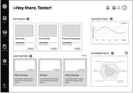
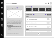
Experimenting with Low Fidelity designs
I began by creating rough sketches of the app's main screens - this includes the main dashboard, course screens, glossary, and login page.
Iterating
Garnering Feedback
Throughout my process, I went through multiple iterations of my original design. I focused each test on specific features as I designed them.
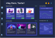
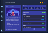
Hi-Fidelity Screens
Design System
To ensure the app had a techy, but kid friendly mood, I opted in for a retro-ish purple color scheme with cartoony images. I paid special attention to ensure legibility and that color semantics were easy to understand for a younger audience.

Next Steps...
Because this project had a limited time frame, in the future it’d be helpful to conduct actual usability tests with a larger pool of users. If possible, it would especially help if the users actually match my targeted audience since right now all of the feedback came from adult users.